
Making 1.7% Look Bigger Than It Is
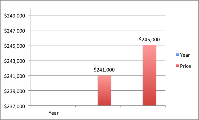
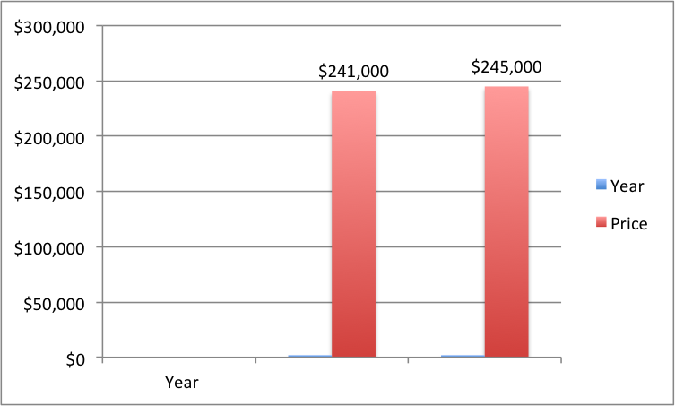
So, which chart — top or bottom — is projecting a stronger 2015 for U.S. home prices?
Top one, right?
Nope.
Fun With Numbers
Both charts project 2015 home prices increasing (a rather paltry) 1.7%, from $241,000 to $245,000 — which in fact is the blended consensus from Realtors and lenders nationally.
The difference is that the y-axis in chart #1 starts at $237k, and increases in increments of $2k.
By contrast, the y-axis in chart #2 correctly starts at $0 and increases in increments of $50k.
See also, “Twin Cities Housing Market Statistics: One Size Doesn’t Fit All”; and “National Housing Statistics and Laurel & Hardy’s “Average” Weight.”
